A Safe Harbour for the Homeless, Addicted and Mentally Ill

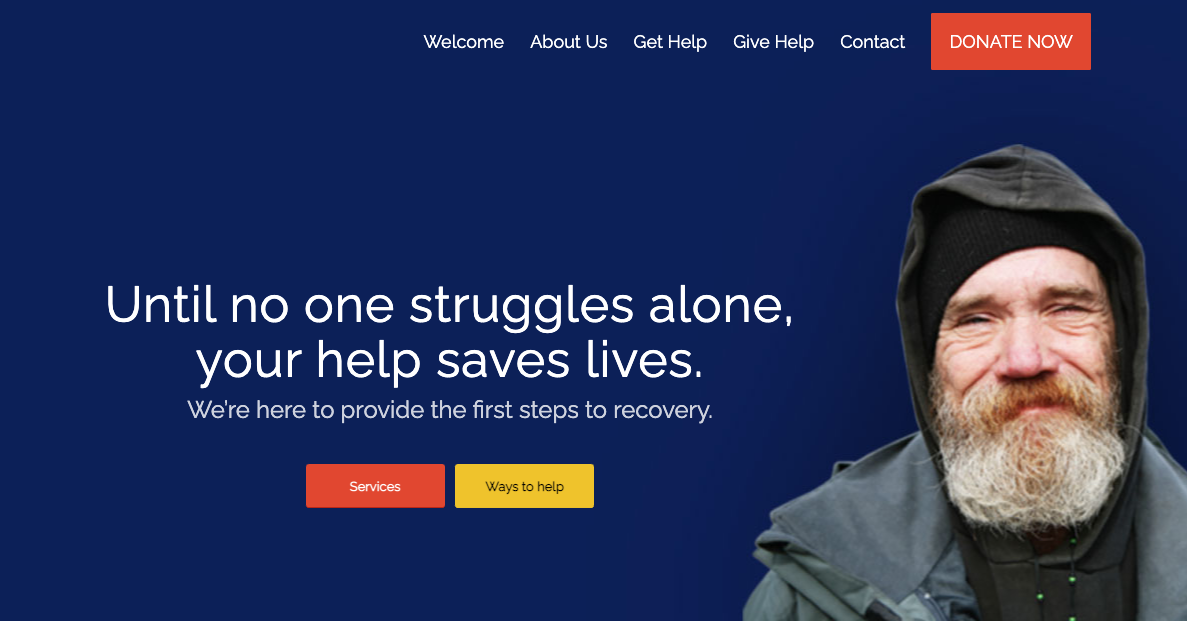
Here is the result of a Storyboarding session with a Canadian non-profit organisation. The connection was made through Non-profit.today - a branding agency I had worked with before. The challengeTheir communication challenge was to figure out a brand story for Safe Harbour. They want the citizens' acceptance, who tend to feel threatened by Safe Harbour's "misfits" and are failing to see the benefits. What they currently have on their website is the (nice) portrait of a homeless man who found shelter at Safe Harbour. There is nothing wrong with the design of the website.
But they don't need the acceptance of the homeless, who are happy that they get a safe place to sleep, food, and a shower.
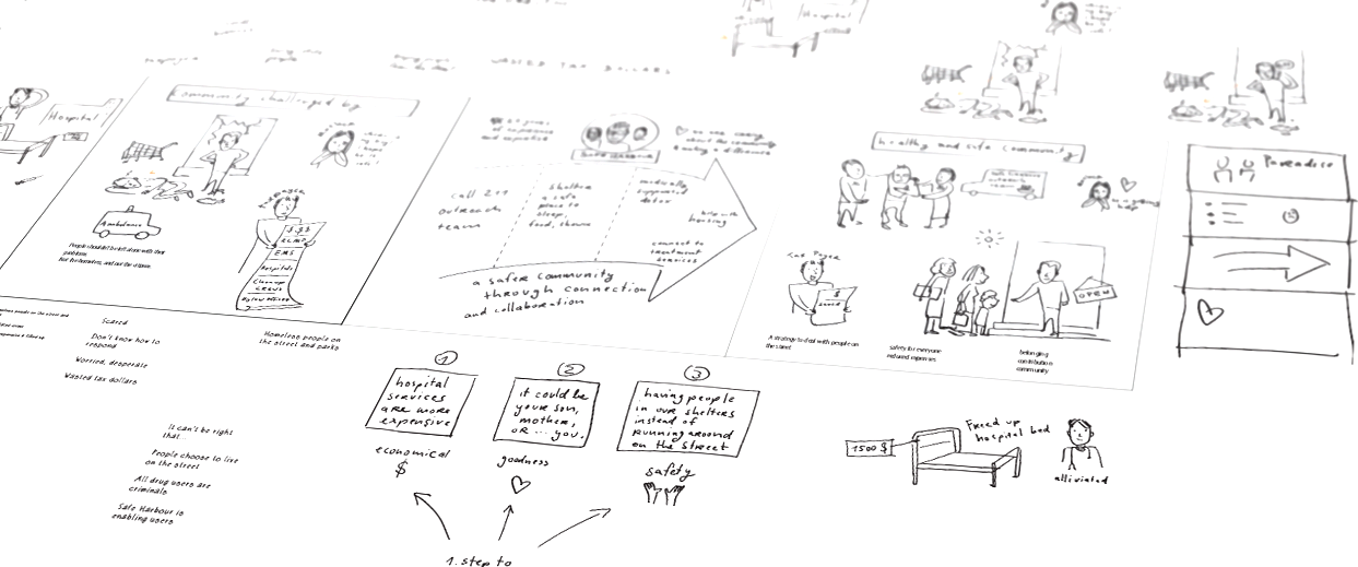
We had to figure out who should be the "hero" of the communication. The processWe got together on a Zoom call – four people in Canada, and me in Denmark. They told me about the complaints of the citizens, who wish that the whole problem would just go away. And Safe Harbour needed the acceptance - otherwise they would continue to fight on two frontiers. And then I just listened to the stories and drew as we talked. It was a long session, and we rearranged the various elements several times. We identified three categories of arguments that we should address: economical, humanitarian, and safety. Identified the "shop owner" as a representative of the community, and made him the hero. Here is a glimpse of the original sketch. Not all drawings made it onto the final storyboard:
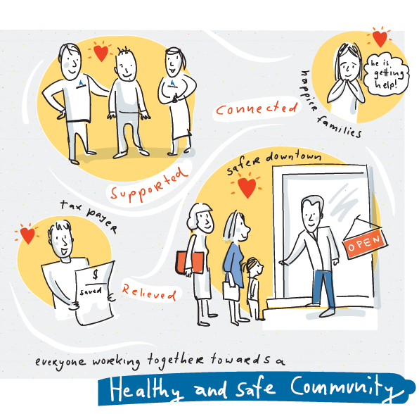
The ResultHere is a breakdown of the storyboard, colored in with Safe Harbour's existing brand colors:
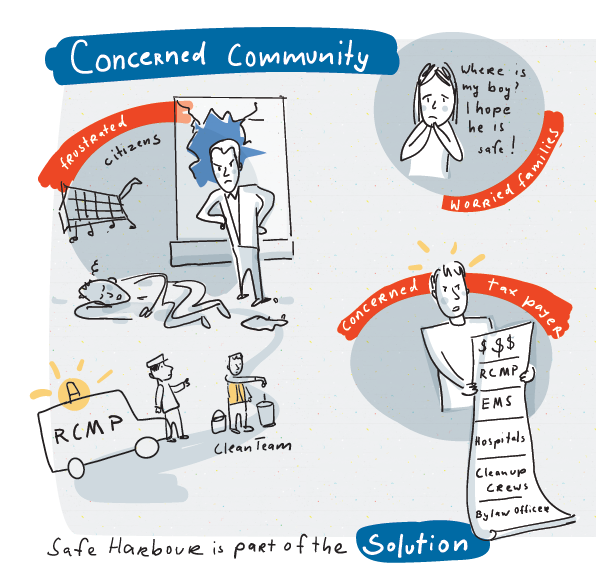
On the left side the concerned community. The frustrated shop owner, the unnecessary expenses (a hospital bed is much more expensive than the shelter at Safe Harbour), and the concerned mother.
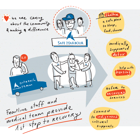
The middle part: What Safe Harbour is doing for the city. Sending an outreach team, and support "buddy" as they call him, with a safe place to sleep and the first steps towards recovery.
On the right side, we painted a picture of the ideal future. This is what Safe Harbour and the community are working towards.
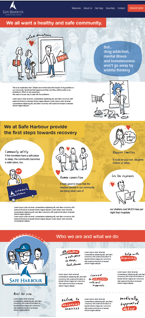
Implementation:This is my suggestion how it could look if they choose to use the illustrations on their website. But the brand story is not dependent on the illustrations. What we identified in the session was the narrative – which can be told in many ways. With photos, text – and also with illustrations.
Here is what Kath Hoffman said about their Storyboarding experience: "The story we were telling seemed complex and confusing. Not so for Ingrid Lill. On a group call, Ingrid listened intently to us, extracted key elements, and worked her magic into a fantastic, easy to understand storyboard the whole team can identify with. I highly recommend her to anyone looking to make a strong impact with their message!"Kath Hoffman |